Designer Guide
Table of Contents
Getting Started
This page is built to be a reference page and instructional guide for how to work within the Webflow designer in a way that keeps this website organized and clean. It is recommended to view this page on the live url so that you can see the populated table of contents (left), and navigate through the page more easily. Note: All the pages in the dev folder are set to not be indexed by search engines so website viewers won't stumble across them.
What is Client First?
This Website is built using the Client-First design system which is a method for building websites that helps provide consistency and promote best practices for Webflow development, it is recommended that if you are consistently working within the Webflow designer on this site you read through the entire Client-First docs. That being said reading the full documentation can be time consuming and a little overwhelming to people who are still learning Webflow so this page is built to be a quick reference page of the core principles so that you can get started updating your website ASAP. Throughout this page there will be links to pages of the full documentation so that you can reference it if you have questions that this page doesn't cover.
Why bother?
While you could definitely go into this project and start making updates without reading this guide doing so will quickly make the website much less organized, harder to update in the future and could potentially break or modify parts of the site in an unintended way so it is much better in the long run to take 20 minutes and read through this page before making edits to the website. Each main heading has a key takeaway section to help you read this page quicker and keep the most important things in mind.
The Goals of Client First
- To create an organization system for our project
- To enable speed and flexibility when using Webflow Designer
- To define a strategy for class usage in the project
- To standardize a core structure shared across all pages
- To create a Webflow build that is scalable and easily manageable
- To help developers, clients, or anyone understand the project
Class Naming
One of the most important aspects of Client-First is class naming, it is a key part of making sure that anyone can go into the Webflow project and make edits easily. The goal of a class name is to help someone be able to look at a class and immediately tell what is used for so they can confidently make changes to it if need be and know if it is affecting the entire site, just a specific component, or even a single page.
Class names should say what they do. When creating a name for a class, we can think of these questions:
- "What is this class doing in the project?"
- "What is the purpose of this class in the project?"
- "How can I give the most context into what this class is responsible for in the project?"
The name of a class should answer these questions.
All class names should be in lowercase. Instead of using spaces, class names will include hyphens and/or underscores based on if they are a utility or a custom class (more information on Utility and Custom classes below).
The two main types of classes
The two main types of classes that you'll be using/creating are Utility classes and Custom Classes. There are more types of classes (Global Classes, and Combo Classes) but the distinction between those is a little more nuanced and so in order to simplify things for this reference page I've left those details out, in order to fully understand how different types of classes interact view the classes strategy page here.
Utility Classes
Utility classes are global classes that are used throughout the project. These help you to speed up your workflow and maintain control of consistent spacing and structure elements across your site allowing you to make edits to the entire site quickly when need be.
A great example of a utility class is padding-global which allows you to control the left and right padding for the entire site. So if at any point you decide the tablet breakpoint needs to have more padding between the content and the edge of the viewport you can do that by modifying one class without having to go through and edit each section or page individually.
Utility class examples:
- padding-global
- text-size-large
- background-color-black
- button
All Utility classes will NOT use an underscore in the class name
As a general rule you shouldn't have to create new Utility classes for this project, all the utility classes you already need are already set up for you and are are stored on the style guide page so that you can quickly browse through examples of those classes and see what they do.
Utility classes will be used for one of the following purposes:
- Core page and section structure (padding, containers, spacing etc...)
- Text styles (Headings, Text weight, Text size etc...)
- Color Styles (Background Colors, Text colors)
- Re-used UI elements (Buttons, Form elements, Icons)
- Global spacing system
Each utility class is made for a single purpose and generally shouldn't be modified to fit another purpose. For example, text-weight-bold only makes the weight of text bold and so it would be bad practice for you to modify it to also have be underlined and aligned to the center. This is because it makes the class name inaccurate, and will often have unintended consequences on other parts of the site where that class is used. Additionally, if you have a text block later on that you just want to be bold you can no longer use text-weight-bold without also affecting the underline and alignment. Instead of doing this you can either stack up to four utility classes to create the desired effect (text-weight-bold text-align-center text-style-underline) or you can create a custom class.
Class Stacking
Class stacking is when you add multiple classes to an element. Stacking classes in Webflow can be helpful but can also create a more confusing and difficult to edit experience so this should be done with care. In the Client-First system you should never stack more than four classes, deep stacking classes can cause a lot of hidden issues and also creates difficulties when trying to edit an element. Often when you find yourself doing this you should create a custom class instead.
Rules for working with stacked classes:
- Never stack more than 4 classes
- If you have several stacked utility classes don't modify any of the properties as this creates unpredictable behavior throughout the site and can cause a lot of confusion. For example, if an element has text-size-large text-weight-bold text-align-center and you need to make a sizing adjustment on the mobile breakpoint you should just remove those classes and make a new custom class instead. The finsweet chrome extension has a some great helper tools for instances like this.
- If you see a combo class like with the is- prefix like button is-secondary you can feel free to modify those properties. Combo classes are a bit more advanced and so if you are a beginner I'd recommend not making new Combo classes without reading the documentation on how they work.
Custom Classes
The second main type of classes you'll be encountering are custom classes, these are classes that were created for a specific component, or page. These are called "custom" classes because they are custom outside of the project’s utility classes. Custom classes should be created when utility classes can not, or should not, be used on an element. The class is custom to that element. Custom class names use the following convention home-header_heading-wrapper. On the left side of the underscore is the name of the component, this name is meant to describe a group of elements that work together (in this case the home-header component). On the right side of the underscore are keywords meant to describe the specific element the class is for (in this case the heading wrapper).
Custom class examples:
- footer_column
- navbar_link
- testimonial-slider_headshot-wrapper
- services-item_background-texture
All Custom classes use an underscore in the class name
As you'll notice both the component name and the keyword can include multiple words divided by hyphens but the component name is always on the left of the underscore. What this allows you to do is type footer_ into the class input field and see every single class that is made for the footer. This makes it much easier to know what you are modifying and not accidentally create unintended consequences when updating styles.
Naming Custom Classes
When naming custom classes use a name that describes what the component is, both clearly and succinctly. If the component is made for use on multiple pages it can have a more general name like header_component whereas if it made for a specific page the first keyword should reference that page eg: blog-subscribe_component. When you are creating different classes for a component generally the outermost div should have the keyword component as used in the examples above. This helps create a visual separation between components and keeps elements that are named together within one space.
Note that just because you are creating a component does not mean you cannot use utility classes within that component. For example you'll often use you'll often have a heading with heading-style-2 or a button with button classes that don't need to be named based on the component because those classes are managed globally and are not specific to the component you are working on.
Custom classes are generally used for one of the following purposes:
- Layouts (grids, split layouts etc..)
- Design elements (cards, sliders, light boxes etc...)
- CMS Elements
- Text styles that would require over 4 utility classes
- Webflow interactions
Key Takeaways
- Always name your classes! Never leave a class with a default name of Div Block 2 or Image 13
- All class names should be in lowercase and avoid using spaces
- Keywords go from general to specific within a class name
- Never stack more than 4 classes
- Do not modify css styles on stacked utility classes, create a custom class instead.
- When making new custom classes default to the following naming convention component-name_element-keywords
- When modifying a class first make sure you understand where the changes are going to take effect. Modifying the home-header_layout should only effect the header component on the home page whereas modifying the padding-section-large will affect every section that uses large padding. Look underneath the class in the style panel to see how many times the class is used throughout the website.
- Use utility classes when possible but don't be afraid to create new classes if you need something unique.
Core Structure
Every page on your website uses the following core structure. It uses 6 different layers of Div Blocks and each layer has a specific use in helping you to create a web page. Below are descriptions of each of the classes used in the core structure so you can understand what their role is and use them appropriately.
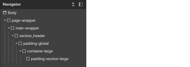
page-wrapper
The page wrapper class holds every element on the page and is useful for copying and pasting content between pages, on some websites it can also be useful for providing styles to the entire page.
main-wrapper
The main content of the page. Use a <main> HTML tag that wraps all or most of our website content sections.
The nav, footer, and global styles symbols should not be inside this main tag.
Styles are optional in the main-wrapper, they can be added if they are needed.
section_[section-identifier]
The primary use case of the section class is to give you a better workflow inside Webflow Designer. This element organizes the Navigator view and helps you quickly move inside the Designer canvas.
This Div Block wraps an entire section of content. It is recommended to set the HTML tag of this element to <section>. You can do this on the Settings panel of the section_[section-identifier] element.
Note that the section classes are the only classes that use an underscore but are not tied to a component. Often you will have a component of the same name inside but that in not always the case. For example section_faq may contain padding-global, container-small, padding-section-large, and then faq_component which will have more faq related classes inside like faq_item.
A homepage may have sections like header, about, how it works, testimonials, and contact. You should name sections with descriptive titles to understand what's on the page.

padding-global
Global horizontal spacing. This class manages the left and right padding of a page's content.
Do not want to use this class to add space to content items. For example, you shouldn't use this class to style the padding of a content item in a list.
padding-left and padding-right are the only CSS properties styles on the padding-global class. Do not add other CSS style properties to this class.
There is flexibility in where you can place padding-global. The padding-global style is separate from other core structure styles so it can be used with or without other essential page structures. This is the power of layers.
Separating padding allows you to add padding-global
As a parent of container-large
As a child of container-large
Or both together
Each can result in a different end layout visual.
container-[size]
A unified global container system for content on the page. All, or most, page content can go inside the container- class. The container classes center content on the page and set up unified max-width values across the project.
There are 4 different default container sizes container-xlarge container-large container-medium container-small. You can use whichever container size best fits the layout and content of a specific section.
padding-section-[size]
A unified global vertical spacing system for sections; creates top and bottom padding inside a section.
There are 3 different default padding-section sizes padding-section-large padding-section-medium padding-section-small. You can use whichever size best fits the layout and content of a specific section.
If you have a unique section padding, you can apply unique styles to the section's section_[section-identifier] class.
Key Takeaways
- Use the 6 Core Structure classes above to create consistency throughout the project.
- You can copy and paste the page-wrapper element to easily bring elements from other pages into a new page.
- By correctly naming sections it makes it easy to view at a glance what sections are in each page and click on them in the navigator to scroll to them.
- The container-[size] and padding-section-[size] classes each have several options, allowing you to quickly adjust the max-width and spacing of a section by simply changing the class.
Typography
Typography should be our project's most simple and organized type of utility system. Websites with unified typography systems help us to be clear to the user.
We can think of HTML typography tags as our default typography values.

We use a class when there is a variation from the default typography style. A class changes the default typography value. For example, a global utility class such as text-size-medium.
Using Utility type classes
Client-First comes with global utility typography styles to help unify, organize, and manage typography variations. The text- and heading- prefixes are used throughout typography utility classes (you can view these on the style guide page).
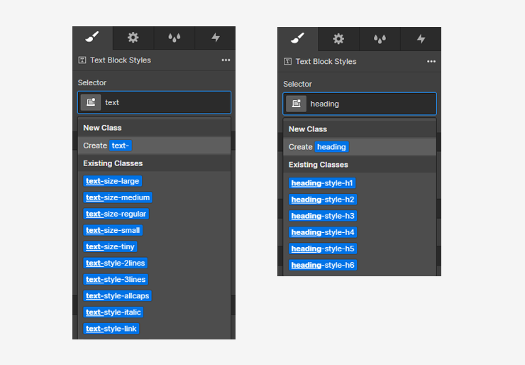
Working with headings
Sometimes when you are working with typography the design style you are wanting to use for an element does not match the html tag you should use for SEO.
For example, you need to use an H1 tag for the page's title. The H1 is required for SEO and page crawling. However, the styles of this title should follow the H2 styles of the project. This creates a conflict where the SEO-required Heading tag needs the default styles from a different Heading tag.
You can apply heading-style-2 to the H1 element to mimic the H2 style while maintaining the H1 tag for SEO.
As another example in the image below, the text "Thanks" is featured. You do not want to use the Heading tag for this use case because it is not a Heading with relevant content. However, you need the styles from H2.
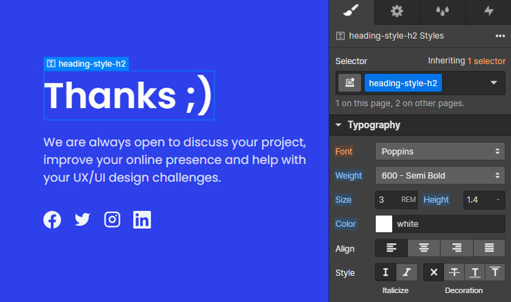
Instead of using a Heading tag for non-Heading elements, you can use a Text Element and add the heading-style-h2 class to style it.
Key Takeaways
- Use text- and heading- prefixes to quickly find and use typographic utility styles (you can view these on the style guide page).
- Use the correct html tags for SEO value and if need be override the visual style using a class like heading-style-h2
Sizes and rem
Webflow defaults to px units. If you type "10" into any Designer input and press "Enter", it will set "10px". Client-First uses rem, which you can select in the unit dropdown.
The Client-First system uses rems rather than pixels as the default unit of measurement. Using rems is an important part of web accessibility and making sure that your site is usable by anyone on the web. For a detailed explanation of how rems work check out the Client-First page on it.
Translating pixels to rems
Rem units are dynamic meaning that they will change based on the user's preferences for font size and possibly browser screen size, but the default conversion from pixels to rems is 16 px = 1 rem. You can do math within the webflow designer allowing you to quickly convert from one type of unit to another.
Inside the width input of Designer, type "64/16rem", press "Enter", and see the rem value calculated. You can use * to multiply / to divide, +, and - to more quickly adjust/translate spacing values if needed
For convenience, it's best to use easily readable rem values like 1, 2, 2.5, 3, 4, 5.
Avoid usage of long number values like 8.4375rem. These values are more difficult to remember and will slow you down in your workflow. For a helpful guide on recommended rem and pixel values check out this resource.
Key Takeaways
- Use rem as the default spacing value rather than pixels
- 16 px = 1 rem
- You can do math inside the designer input fields to quickly translate pixel values
Spacing Strategy
Throughout this project you will see divs that have utility classes like margin-bottom margin-small or padding-vertical padding-medium and you may want to adjust the spacing that these classes are creating. In order to do that correctly you need to know how this spacing system works.
Margin adds space outside an element, padding adds space inside an element. These margin and padding classes allow you to easily and quickly add and modify spacing for elements throughout the site; the first class modifies the direction of the spacing, and the second class modifies the amount of space.
The direction and size classes are the same for both margin and padding, they just adjust where the space is added. The included directions are -top, -bottom, -left, -right, -vertical, and -horizontal. For a full list of the classes and what size they each are view this page
As a general rule do not modify the values of spacing in these classes, simply change the class to a size that is better suited.
For example if you find a heading that is inside a element with the following classes margin-bottom margin-medium and you want to make the spacing below the heading larger, rather than modifying the number of rems within the spacing style simply remove the margin-medium class and add a margin-large or a margin-xlarge class instead. Once you type margin- into the Webflow selector field it should auto populate with options below.
If you need spacing that is specific to a particular element or has a unique way of adjusting to mobile it is best to create a custom class for that spacing, eg: contact-slide_heading-wrapper. For a full explanation of spacing strategies in Client-First read this page.
Key Takeaways
- Margin adds space outside an element, padding adds space inside an element.
- Use a combination of direction and size classes to quickly add spacing like: margin-bottom margin-medum
- As a general rule do not modify the values of spacing in these classes, simply change the class to a value that is better suited.
- If the spacing utility classes don't aren't flexible enough for what you need feel free to create a custom class instead.
Resources & Acknowledgments
That is the end of this introduction to Client-First, as was said at the beginning this is only an introduction and reading through the entire documentation is highly recommended as it will teach you a lot about how to be a better webflow developer.
Hopefully this guide has been a helpful resource in learning how to better edit your website and also learn best practices for Webflow at the same time. If there were aspects of this that were confusing or poorly worded please reach out and let me know.
The Client-First system was developed by Finsweet
This page was created by Caleb Raney the Webflow designer who built your website, if you have more questions as you read this and are working within your website feel free to get in touch.
You can reach me at my website or by email