

Giving a window into what’s possible
With a new brand story in place, the question turned to how to visualize the value Belden brings. A few challenges presented themselves.
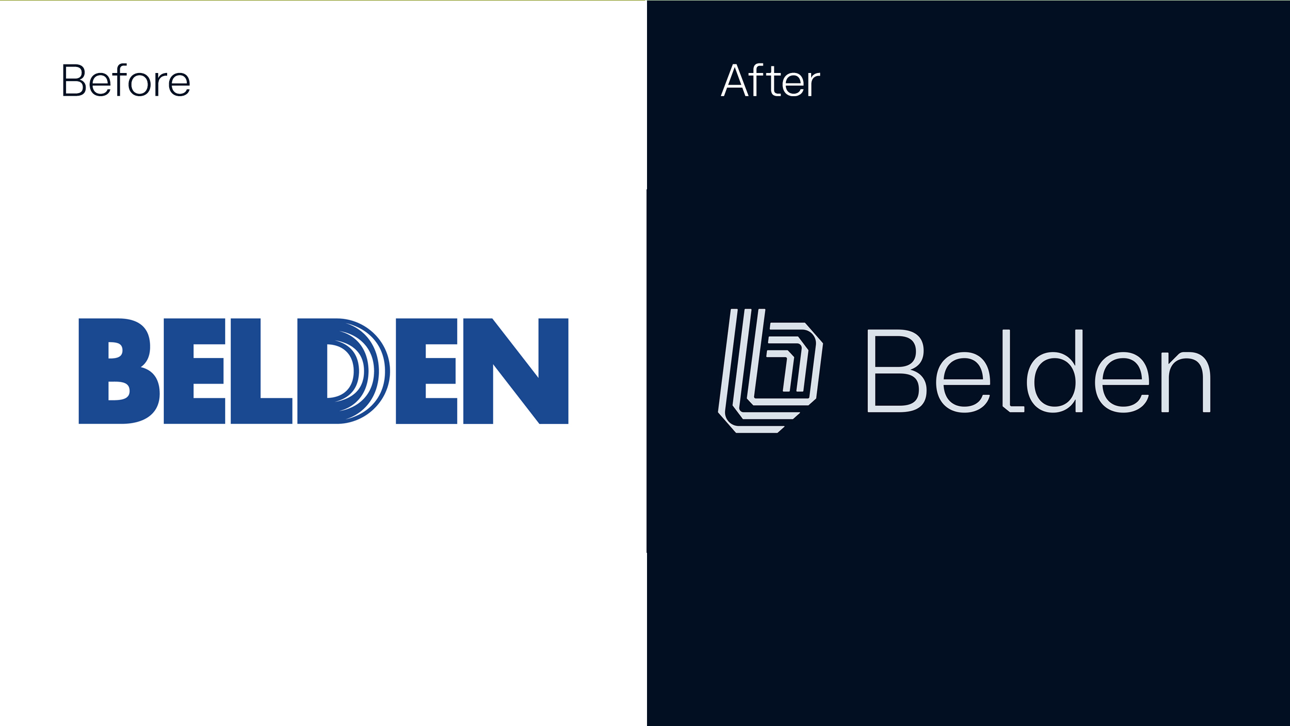
First, we needed visuals that would evoke the idea of bringing disparate forces together to unlock new possibilities. Next, we needed a way to illustrate connections without any of the usual industry clichés– dotted lines, Jetsons-style environments and vaporware overlays. Lastly, the brand had to cool it with the blue, as almost all the major players in the industry were swimming in the same corner of the color spectrum.
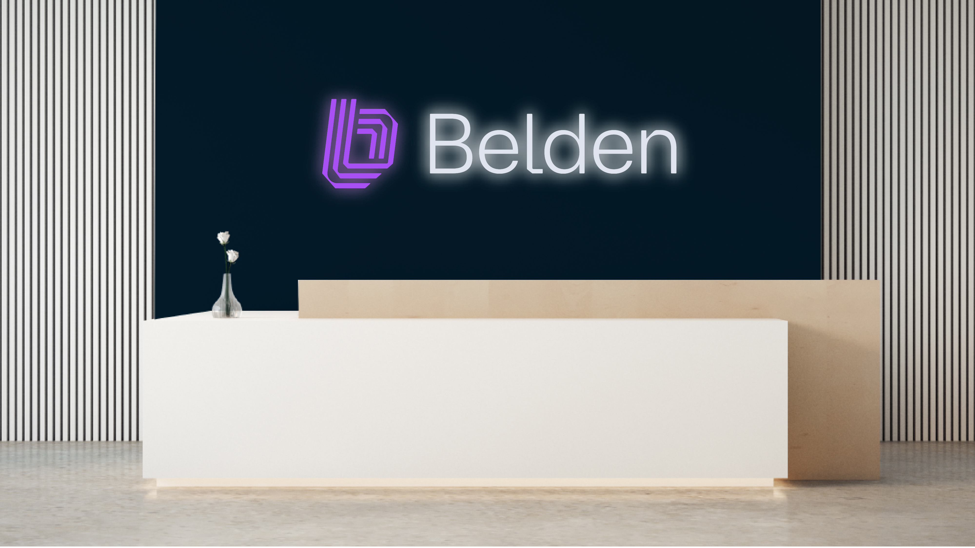
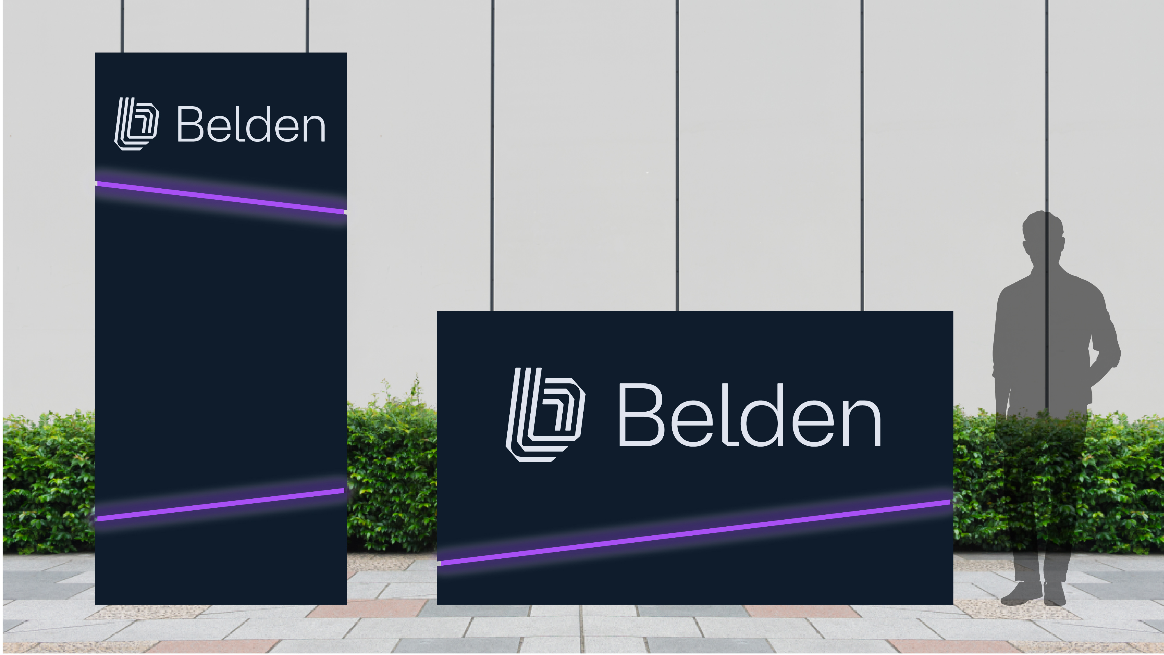
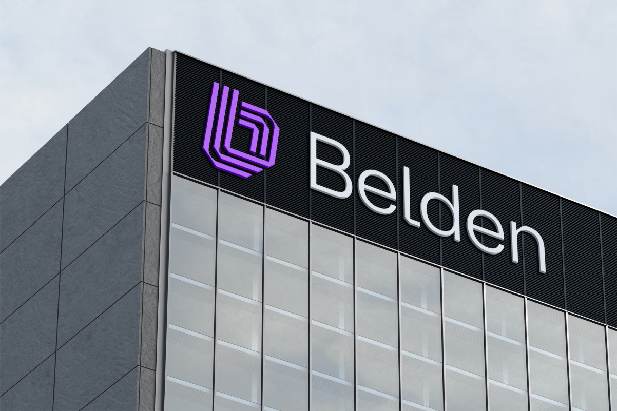
In the end, Belden’s look evolved from bulky and industrial to sophisticated and tech-y. For the logo mark, three parallel lines form a lower case “b,” symbolizing the way Belden brings together people, information and ideas to create something greater than the sum of its parts. The negative space at the center of the logo forms a “window into what’s possible,” which is extrapolated into a reoccurring graphic device visualizing how Belden makes connections to enable impactful outcomes. All is expressed in a color palette that’s sleek, modern and marked with pops of vibrant purple.
Capabilities


You might also like


Put Artful Problem Solving to work for you.

